Introduction
The term ‘Yaponesia’ was proposed by Toshio Shimao in the 1960s (e.g. Shimao, 1977) to refer to the Japanese archipelago, and later Saitou (2015, 2017) defined the three geographical areas of Yaponesia: northern Yaponesia (Sakhalin Island, Kuril Islands, and Hokkaido Island); central Yaponesia (Honshu, Shikoku, Kyushu Islands, and surrounding smaller islands); and southern Yaponesia (Nansei Islands including Amami and Okinawa regions). Saitou (2015, 2017) and Saitou and Jinam (2017) proposed a three-wave migration model for Yaponesia.. The estimated time frames of these migrations according to Saitou (2017) are: (1) Paleolithic and the middle period of Jomon (40000 years before present (BP) to 4500 BP) for the first wave; (2) late and final Jomon periods (4500 BP to 3000 BP) for the second wave; (3) Yayoi period (3000 BP) to present day for the third wave.
The people involved in those three waves may be hypothesized as follows. Hunter-gatherers from Siberia, continental East Asia, and/or Indochina migrated to Yaponesia during the first wave. This migration wave has been well discussed (e.g. Suzuki, 1983; Hanihara, 1991; Omoto and Saitou, 1997). We propose a somewhat mysterious ‘sea people’ as the second-wave migrants. They may have been hunter-gatherers who mainly relied on fishing and were distributed from the coastal area of southern China to the Shandong peninsula, the Yellow Sea, and the Korean peninsula. Shinoda et al. (2019) analyzed ancient DNA of people who lived on Gadeok Island, located of the southeast coast of Korean peninsula about 6300 years ago, and reported that they had a much higher Jomon component than modern Koreans. Shima (2020) recently stressed the importance of fishing in modern human dispersal. These two literatures seem to support the existence of ancient hunter-gathers who mainly relied on fishing on coastal areas of continental East Asia. These ‘sea people’ were replaced by rice farmers whose population size quickly expanded between 7000 BP and 5000 BP, and these ‘sea people’ eventually migrated to Yaponesia during the late and final Jomon periods (4500 BP–3000 BP). There is a possibility that these ‘sea people’ spoke an ancient Japanese language, which could have been the ‘lingua franca’ of people in coastal East Asia at that time (Saitou, 2015, 2017). Rice agriculture was introduced c. 3000 BP (e.g. Fujio, 2015; Nasu and Momohara, 2016) by the third-wave migrants whose homeland was somewhere in continental East Asia. This migration wave still continues today, for the highest proportion of international marriages in Japan includes Chinese and Koreans (e-Stat, 2018). We will discuss the plausibility of this three-wave migration model based on genome-wide single-nucleotide polymorphism (SNP) and mitochondrial (mt) DNA analyses.
Materials and Methods
We utilized three kinds of datasets, each with their corresponding methods. The first dataset was a total of 1642 complete mitochondrial genomes from Yaponesians (Table 1). These included 1115 published sequences (Tanaka et al., 2004; Kazuno et al., 2005; Bilal et al., 2008; Ueno et al., 2009; Nohira et al., 2010; Mikami et al., 2013), 417 unpublished mitochondrial genomes of people from Tokyo (DNA data are the same as is Nishida et al., 2008), and a total of 80 unpublished sequences we determined for Yaponesians from Izumo and Makurazaki. It should be noted that 13 mtDNA sequences reported by Tanaka et al. (2004) were identified as artificial recombinants (Kong et al., 2008), so we used mtDNA data of 657 individuals, not 670 as originally reported by Tanaka et al. (2004). These 1642 Yaponesian mtDNA genome sequences were used to estimate effective population size changes over time. These sequence data were aligned using MAFFT (Katoh and Standley, 2013), and insertions and deletions were omitted. BEAST software (Drummond and Rambaut, 2007) was used to generate a Bayesian Skyline plot using two datasets: whole mtDNA (16570 bp) and a coding region (a concatenation of 13 protein-coding gene sequences; 11341 bp). The substitution model of Tamura and Nei (1993) was used, assuming a strict molecular clock with separate substitution rates for whole mtDNA and coding regions: 2.67 × 10⁻⁸ substitutions/site/ year and 1.57 × 10⁻⁸ substitutions/site/year, respectively (Fu et al., 2013).
Table 1
List of complete mtDNA genomes used
The second dataset used was mtDNA haplogroup frequency data of 59105 Yaponesians living in all 47 prefectures provided by Genesis-HealthCare, Ltd, as shown in Supplementary Table. Principal-component analysis (PCA) was performed using R version 3.6.3, Nei’s (1972) standard genetic distance was calculated using phylip version 3.698 (Felsenstein, 2005), and the genetic distance matrix was used to making neighbor-net networks (Bryant and Moulton, 2004; Huson and Byant, 2006). We classified 47 prefectures into a central axis area and a peripheral area based on Saitou’s (2017) proposal as shown in Table 2 and Figure 1. The central axis of Yaponesia starts from northern Kyushu and stretches to Edo/Tokyo, the city which has been the political center of Yaponesia from the early 17th century. Northern Kyushu was the first region to adopt wet rice agriculture (e.g. Fujio, 2015) and was the political center of western Yaponesia during the early and middle Yayoi periods. The Nara–Kyoto area was the political center of Yaponesia from the late Yayoi period to the end of 16th century (also known as the Azuchi–Momoyama period in historical literature).
Table 2
Classification of 47 prefectures of Japan into two areas
| Prefecture name |
Abbreviation |
Region |
| (A) 20 prefectures in central axis area (red in Figure 2) |
| Aichi |
AIC |
Tokai |
| Chiba |
CHI |
Kanto |
| Fukuoka |
FKK |
Kyushu |
| Gifu |
GIF |
Tokai |
| Gunma |
GUN |
Kanto |
| Hiroshima |
HIR |
San-yo |
| Hyogo |
HYO |
Kinki |
| Ibaraki |
IBA |
Kanto |
| Kanagawa |
KAN |
Kanto |
| Kyoto |
KYO |
Kinki |
| Mie |
MIE |
Tokai |
| Nara |
NAR |
Kinki |
| Okayama |
OKA |
San-yo |
| Osaka |
OSA |
Kinki |
| Saitama |
SAI |
Kanto |
| Shiga |
SGA |
Kinki |
| Shizuoka |
SZK |
Tokai |
| Tochigi |
TTG |
Kanto |
| Tokyo |
TKY |
Kanto |
| Yamaguchi |
YMG |
San-yo |
| (B) 27 prefectures in peripheral area (white in Figure 2 except*) |
| Akita |
AKI |
Tohoku |
| Aomori |
AOM |
Tohoku |
| Ehime |
EHI |
Shikoku |
| Fukui |
FKI |
Hokuriku |
| Fukushima |
FKS |
Tohoku |
| Hokkaido |
HOK |
Hokkaido* |
| Ishikawa |
ISI |
Hokuriku |
| Iwate |
IWA |
Tohoku |
| Kagawa |
KGW |
Shikoku |
| Kagoshima |
KGS |
Kyushu |
| Kochi |
KOC |
Shikoku |
| Kumamoto |
KUM |
Kyushu |
| Miyagi |
MIG |
Tohoku |
| Miyazaki |
MIZ |
Kyushu |
| Nagano |
NGN |
Koshin-etsu |
| Nagasaki |
NGS |
Kyushu |
| Niigata |
NII |
Koshin-etsu |
| Oita OIT |
Kyushu |
|
| Okinawa |
OKI |
Okinawa* |
| Saga |
SAG |
Kyushu |
| Shimane |
SMN |
San-in |
| Tokushima |
TKS |
Shikoku |
| Tottori |
TTT |
San-in |
| Toyama |
TYM |
Hokuriku |
| Wakayama |
WAK |
Kinki |
| Yamagata |
YGA |
Tohoku |
| Yamanashi |
YMN |
Koshin-etsu |

The third dataset comprised 639912 autosomal SNP data from two Japanese populations (Ainu, Ryukyuan) reported by the Japanese Archipelago Human Population Genetics Consortium (2012). This SNP dataset was merged with whole-genome sequence data of the Funadomari Jomon F23 individual (Kanzawa-Kiriyama et al., 2019), 27 Japanese (Bergström et al., 2020), 40 Koreans (Zhang et al., 2014), 45 Han Chinese Beijing (CHB), and 45 southern Han Chinese (CHS) (Bergström et al., 2020). After pruning the dataset for linkage disequilbrium (LD), the resulting 192898 SNP data were used for admixture analysis (Alexander et al., 2009). Merging of datasets and LD pruning was performed using PLINK version 1.9 (Chang et al., 2015).
Results and Discussion
Dataset 1
We first estimated population size changes over time using 1642 complete mitochondrial genomes of current Japanese. There were sharp increases in the population size during the last 3000 years when using either coding region only (Figure 2A) or complete mtDNA (Figure 2B). This increase in population size corresponds to the start of the Yayoi period, just after the Jomon period (16500 BP–3000 BP) (Fujio, 2015; Yamada, 2019). Population size during the Jomon period peaked during the middle Jomon (5500 BP–4500 BP), based on archaeological data (Koyama, 1978). However, this peak in population size was not observed in Figure 2A and B. Instead, much older dates (25000 BP and 38000 BP for Figure 2A and B, respectively) showed second points of population size increase, corresponding to the Paleolithic period. Saitou (2015) showed a similar result based on 1057 complete mtDNA of Japanese, and a steep population size increase after 3000 BP was also observed. However, its population dynamics was somewhat different.

Okada et al. (2018) estimated past population size changes of modern Japanese using whole nuclear DNA genome data. Their results based on 1276 complete genomes (Figure 2 in their paper) showed that the start of population size increase in the Japanese was 6000 BP, much earlier than the start of the Yayoi period, even before the middle Jomon. This time estimate was based on a “per-generation mutation rate at 1.25 × 10⁻⁸ mutations per base pair and a constant generation time of 29 years” (Okada et al., 2018). Harris (2015) suggested a recent change in mutation rate in human evolution. We have to be careful about time estimates, although the relative pattern of the population size changes may be robust. The bottleneck followed by a rapid increase of the population size was noted both by our Figure 2 and by Figure 2 of Okada et al. (2018). This consistency may mean that the population size increased after introduction of wet rice agriculture in the Yayoi period.
Watanabe et al. (2019) estimated the population size changes of modern Japanese males using 122 Y chromosome D haplogroup (clade 1 in their term) sequence data. They observed a clear bottleneck during the early Yayoi period followed by a sharp increase in population size. The D haplogroup is known to be distributed only among Japanese, Tibetan, and Andamanese, and is thought to have contributed to the formation of the Neolithic Jomon males in prehistoric Japan (Kanzawa-Kiriyama et al., 2019). Watanabe et al. (2019) argued that this sharp decrease was due to a shortage of food resources in the colder final Jomon period.
Dataset 2
Figure 6 shows a two-dimensional PCA plot of 47 Japanese prefectures using the frequencies of 36 mtDNA haplotypes frequencies presented in Supplementary Table. PC1 and PC2 explain 89% and 6.7% of the total variance, respectively. Prefectures are color-coded into two areas according to Supplementary Table and Figure 1—red for the central axis of Yaponesia and black for the peripheral area. Because Okinawa Prefecture (OKI) was so distant from the remaining 46 prefectures, the middle part of the plot was truncated for clarity. Interestingly, central axis prefectures tend to locate on the right side of Figure 3, while peripheral area prefectures are on the left side. If the 47 prefectures are equally separated along PC1 (23 and 24 on the right and left, respectively; indicated by a thin blue line in Figure 3), this biased distribution is weakly statistically significant (5% level using Fisher’s exact test applied to the 2 × 2 contingency table) compared to a random distribution, as shown in Table 3A.

Because of the unique location of Okinawa Prefecture in Figure 3, we eliminated Okinawa and conducted PCA for the remaining 46 prefectures, shown in Figure 4, with PC1 and PC2 explaining 56% and 22% of the total variance, respectively. Now Yamaguchi Prefecture (YMG, classified as central axis) is located at the rightmost position, within proximity to some prefectures in the Kyushu region, such as Nagasaki (NGS) and Kumamoto (KUM). Generally speaking, as in Figure 3, central-axis prefectures tend to locate on the right side and peripheral-area prefectures on the left side. Similar to Figure 3, when equally divided along PC1, the biased distribution of prefectures is again weakly statistically significant (5% level using Fisher’s exact test applied to the 2 × 2 contingency table) compared to a random distribution as shown in Table 3B.
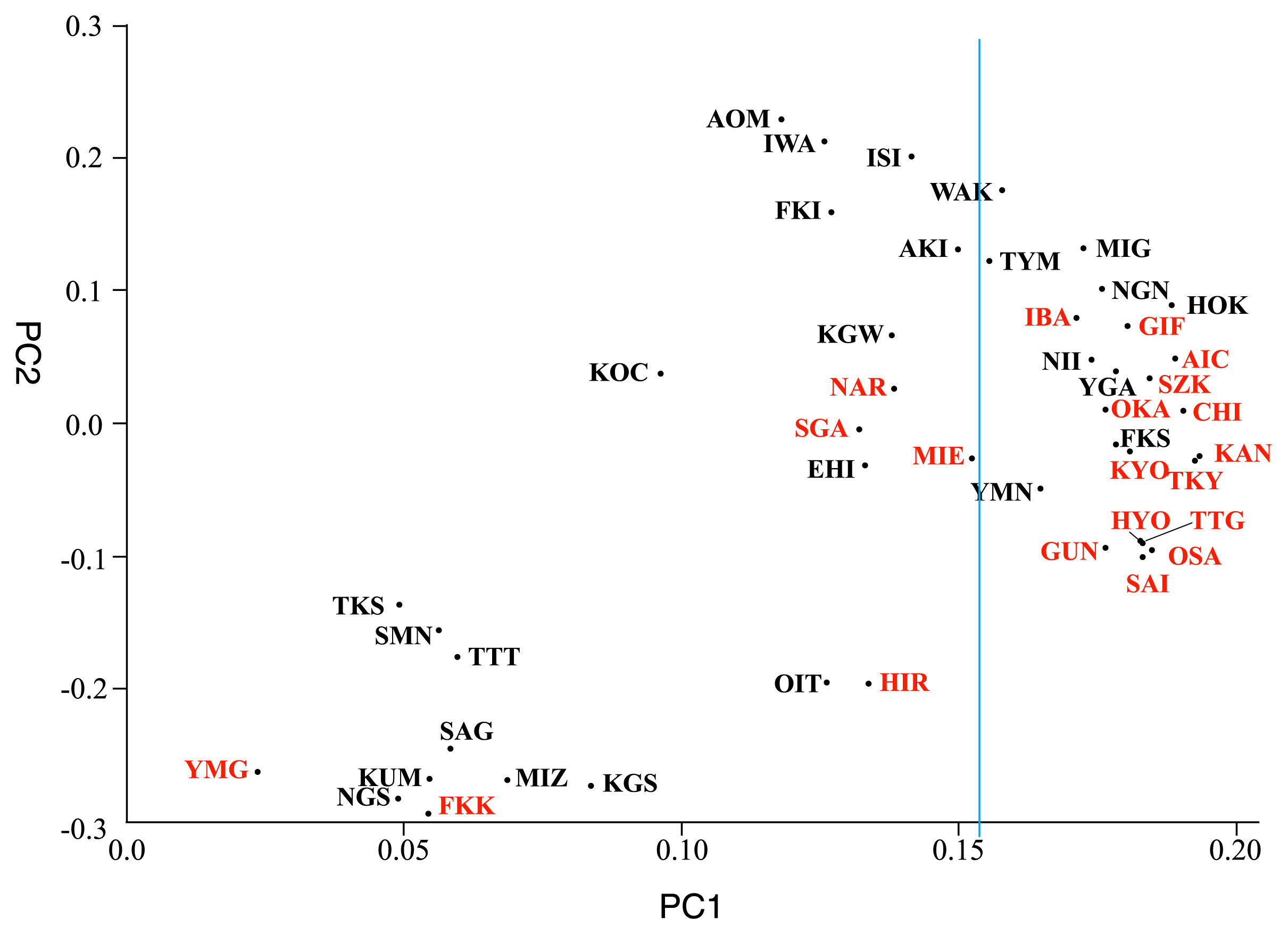
Table 3
Contingency test (2 × 2) for PCA plots of Figure 3 and Figure 4
| (A) Comparison of 47 prefectures (see Figure 3) |
|
Left side |
Right side |
Sum |
| Central axis |
6 |
14 |
20 |
| Peripheral |
18 |
9 |
27 |
| Sum |
24 |
23 |
47 |
P = 0.0189 (both sides: Fisher’s exact test)
| (B) Comparison of 46 prefecturesa (see Figure 4) |
|
Left side |
Right side |
Sum |
| Central axis |
6 |
14 |
20 |
| Peripheral |
17 |
9 |
26 |
| Sum |
23 |
23 |
46 |
P = 0.0361 (both sides: Fisher’s exact test)
a Okinawa Prefecture not included.
Previously, Saitou (2017) presented a PCA plot using mtDNA haplogroup data of 47 prefectures from a total of 18641 Yaponesian individuals, also provided by Genesis-HealthCare, Ltd. Although the relative positions of prefectures slightly differed between Saitou (2017) and our current results (Figure 3, Figure 4), the central axis–peripheral difference of Saitou (2017) was also statistically significant at the 2% level using Fisher’s exact test applied to the 2 × 2 contingency table (see also Jinam et al., 2021). The analysis shown in this paper is consistent with this pattern.
We constructed phylogenetic networks of prefectures using mtDNA haplogroup frequency data. Figure 5 shows a network of all 47 prefectures. As in Figure 3, Okinawa Prefecture is very distantly related to the remaining 46 prefectures. We thus made another phylogenetic network for the 46 prefectures without Okinawa (Figure 6). Central-axis and peripheral prefectures are colored in red and blue, respectively, in both figures. Although there are some topological differences between the two networks shown in Figure 5 and Figure 6, the overall pattern is similar. We thus explain the network of Figure 6, to have an easier grasp of the relationship between prefectures. Generally speaking, central-axis prefectures tend to locate at the center and peripheral ones are literally located peripherally. Prefectures in Kyushu (SAG, KUM, NGS, KGS, MIZ, FKK, and OIT), which are the closest to Okinawa Prefecture in Figure 5, are located in the left side of this network, while those in Tohoku (AOM, IWA, AKI, FKS, YMM, and MIG) are located in the right side. In contrast, prefectures in Shikoku (TKS, KOC, EHI, and KGW) are scattered. KOC (Kochi Prefecture) and EHI (Ehime Prefecture) formed one cluster, whereas KGW (Kagawa Prefecture) is closest to FKI (Fukui Prefecture) in Hokuriku. TKS (Tokushima Prefecture) shares a split with YMG (Yamaguchi Prefecture) in San-yo. Another interesting feature of this phylogenetic network is that prefectures in San-in (SMN and TTT), which formed one cluster, are closest to OIT (Oita Prefecture) in Kyushu. MIE (Mie Prefecture) in Kinki, SZK (Shizuoka Prefecture) in Tokai, and IBA (Ibaraki Prefecture) in Kanto are tightly clustered with a long split; however, this clustering is inconsistent with their geographical locations.

Recently Watanabe et al. (2020) reported analysis of ~140000 nuclear SNP data for 11069 individuals distributed in all the 47 prefectures. They also found a clear difference between Okinawa and the remaining 46 prefectures, and all seven prefectures in Kyushu are closest to Okinawa. This pattern is consistent with that of our Figure 5.
Dataset 3
We now used genome-wide SNP data (see Materials and Methods) for two Yaponesian populations (Ainu and Okinawa), and genome data for Jomon F23 and Yamato, and three continental East Asians (Koreans, CHB, and CHS) to estimate their ancestral population structure. Figure 7a shows the result of admixture analysis when the number of ancestral components (k) was assumed to be 2–7. When k = 2, the two ancestral components are color-coded blue and orange. Interestingly, some Ainu individuals are 100% blue component as in the F23 Jomon individual. The lowest blue component for Ainu individuals was more than 50%. Whereas all Okinawa individuals have more or less 30% blue component, Yamato individuals are on average ~15% blue component. Among continental populations, only Korean has ~5% blue component, and CHB and CHS contain very small proportions of the blue component, if any. This admixture result for k = 2 is very similar to Supplementary Figure 2 of Jinam et al. (2015), and fits well with the dual-structure model of Yaponesian formation; the blue component is indigenous (Jomon) component, and the orange component is migrants to Yaponesia after the Yayoi period.

When k = 3, the orange-colored ancestral component for k = 2 was, roughly speaking, separated into green and orange components, although proportions of the blue component were also slightly modified. Now most of Okinawa individuals are composed of ~90% green and ~10% blue components, and the green component is also dominant (~65%) in Yamato individuals, with orange (~30%) and blue (~5%) components. In contrast, the orange component is dominant (~70%) in Korean and the rest (~30%) were the green component, with no blue component. CHB contains 0–5% green component depending on individuals, and the orange component is 95–100%. CHS is more extreme—almost all individuals have ~100% orange component. If we fit this k = 3 situation to the three-wave migration model proposed by Saitou (2015, 2017), the blue, green, and orange components may correspond to first, second, and third waves, respectively.
When k = 4, the red component appears only in continental populations, and this component is especially dominant (70–100%) among CHS individuals. The red component is also dominant in CHB; 50–100% depending on individuals. Among Koreans, however, only a small proportion of the red component exists in some individuals. If we compare cross-validation (CV) errors for different k values (Figure 7b), the fits for k = 4–7 are as bad as for k = 1 (only one ancestral component), and it seems only cases when k = 2 or k = 3 may be considered to be more realistic.

